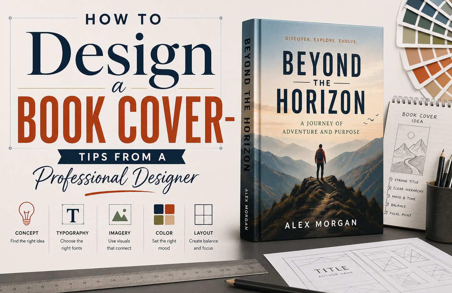
How to Design a Book Cover That Actually Sells: A Professional Designer’s Guide
Most people treat a book cover as decoration. That is the first mistake. A cover is not there to look nice. It is there to sell the book before a single sentence gets read.
Here is something that most guides on how to design a book cover will not tell you: in our research analyzing hundreds of top-selling covers across Amazon categories, the covers that consistently drove the most clicks shared three specific traits. They carried a sense of intrigue. They were precise about the type of book they were, with no attempt to appeal to everyone. And they were minimal but creative, with one strong visual idea executed cleanly rather than several ideas fighting for attention.
That last point is worth expanding. A cover that tries to attract a wider audience by being vague ends up diluting the very readers who were already going to buy it. Precision is not a limitation. It is the strategy.
This guide builds from that research and from years of professional book cover design work. Not theory. Practical decisions. The kind that either make your cover work or quietly kill it.
What Designing a Book Cover Really Means: Signal, Not Art
You are not designing art. You are designing a signal.
A book cover tells the reader what kind of experience they are about to enter. If that signal is off, even slightly, the right audience walks past it. The wrong audience picks it up, feels misled, and leaves a bad review. Getting the signal right is not about being conservative. It is about being deliberate.
What Every Book Cover Must Do Before Anything Else
A strong book cover must accomplish three things in roughly three seconds. It must stop someone mid-scroll. It must make sense instantly with no decoding required. And it must create a specific pull, not vague curiosity, but the kind that makes someone tap the cover instead of scrolling past.
That specific pull comes from precision. A thriller cover that looks precisely like a high-stakes thriller will attract thriller readers. A cover that looks like it could be a thriller or a literary novel or a general mystery will attract no one in particular.
Why Most DIY Book Cover Designs Fail to Convert
Most beginner book cover designs fail in predictable ways. Genre mismatch is the biggest issue. A thriller that looks soft or romantic gets ignored because readers do not pause to figure it out. They move on.
Thumbnail failure is the second most common problem. Shrink the cover to 200 pixels wide, which is roughly how it appears in Amazon search results, and most amateur covers collapse. The title blurs. The image loses meaning. Nothing holds attention.
The third issue is clutter. Too many elements compete and nothing stands out. Our research found that covers with a single dominant visual idea, executed cleanly, dramatically outperformed covers that tried to represent the full story.
The Book Cover Research Method That Top Designers Use First
Before any software opens, before any image is selected, the best book cover designers do research. This is not exciting. But it is where most of the real work sits.
Case Study
I worked on a crime novel set in Austin. The author wanted a muted cover with a quiet street and small serif type. It looked refined. It also looked like literary fiction. Early test readers assumed it was slow and introspective. It was not. We changed it. Darker palette. Stronger title. A hint of threat in the image. Clicks improved within a week.
That is the cost of getting this wrong.
Writers Of The West, client case 2018
How to Build a Bestseller Swipe File for Your Genre
A bestseller swipe file is a personal collection of 20 to 30 top-selling covers in your exact genre and subgenre. Not covers you like. Covers that are performing right now on Amazon, Goodreads, and in physical bookstores.
Open Amazon and go directly to the bestseller list for your specific category. Screenshot or download covers. Then look for patterns. You will start noticing the same font weights appearing in thrillers. The same warm, soft framing in romance. The same restrained, minimal approach in literary fiction. The same bold, high-contrast energy in horror.
This is not about copying. It is about seeing what keeps appearing until it stops feeling like a coincidence. Your book cover design needs to share enough visual DNA with the top performers in your genre that a reader in that genre immediately recognizes it as being for them.
How to Identify Book Cover Design Patterns That Drive Sales
Thrillers almost always carry high contrast, bold condensed type, and a single point of visual tension. Romance leans toward warm tones, softer lighting, and human connection in the frame. Literary fiction holds back with fewer elements and more negative space. Horror uses dark palettes, unsettling imagery, and high visual drama. Self-help and business books often use clean minimal layouts with strong typographic hierarchy.
The cost of getting genre signaling wrong is real. A cover that looks refined and literary for a book that is actually a fast-paced crime thriller will lose readers at first glance. They will assume it is slow and introspective. It will not matter how good the book is inside.
The Three Research Findings That Separate Good Covers from Great Ones
After analyzing top-performing covers across multiple genres, three characteristics consistently appeared in the best-selling designs. These are not conventional design rules. They are patterns we observed in covers that actually drove clicks and sales.
Finding One: Intrigue Beats Information
The covers that performed best were intriguing. Not cryptic. Not vague. But they asked a question the reader needed to answer by clicking. A single element that felt slightly unresolved. A mood that was specific enough to attract the right reader but open enough to create curiosity.
The covers that underperformed were either too literal, showing exactly what the book contained with nothing left to discover, or too generic, showing imagery so broad it could belong to any book.
Finding Two: Precision Over Broad Appeal
This is the counterintuitive one. Covers designed to appeal to the widest possible audience, by being deliberately vague or genre-neutral, consistently performed worse than covers designed for a precise reader.
A cover that is unmistakably for fans of psychological thrillers will attract every psychological thriller reader who sees it. A cover that softens itself to also appeal to general fiction readers ends up attracting neither group convincingly.
The lesson: design for your actual reader with precision. Do not dilute the signal trying to catch everyone. You will lose the people who were already going to buy it.
Finding Three: Minimal but Creative, Not Minimal but Boring
Minimal covers dominated the top performers. But minimal does not mean empty or plain. The best minimal covers had one strong visual idea executed with craft. A single image. A bold typographic choice. A color decision that was specific and intentional.
The covers that failed under a minimal approach were the ones that were simply underdone. Minimal without creativity reads as cheap. Minimal with one strong creative idea reads as confident and professional.
How to Develop a Clear Visual Concept Before You Open Any Software
A good book cover starts before any design software opens. The concept stage is where the cover is actually made. Everything after is execution.
How to Define a Strong Visual Concept for Your Book Cover Design
You need one idea. Not five. It could be an object, a mood, a single moment, or a typographic treatment. Something that holds the entire design together.
If you cannot describe it in one sentence, it is not ready. This is also the rule top book marketing companies often use to pique reader interest. One sentence that makes the reader pick your book from several others of the same genre.
How to Translate Your Story into a Visual Metaphor That Works
Start by writing one sentence that describes the story’s core change or central tension. Not the plot. The change or the feeling. For example, a woman discovers the life she built is built on a lie. That is your anchor.
Now pick one physical object or image that carries that feeling. Not a scene. One object. A wedding ring slightly bent. A house key half submerged in water. A photograph with one face missing. Something real and specific. The cover works when the reader can point at one thing and feel the tension without explanation.
Typography in Book Cover Design: The Element That Decides Everything at Thumbnail Size
Most people look at images first. Professional designers look at type. Because type is what carries the title when everything else shrinks to a thumbnail. And at thumbnail size, a cover lives or dies by its typography.
How to Choose the Right Fonts for Your Book Cover Design
Start with the emotion the book is selling. Fear, romance, tension, inspiration. That single choice narrows everything.
Then check genre norms. Thrillers often use condensed sans-serifs or sharp serif styles. Romance uses softer, sometimes script-based fonts but only when they stay readable small. Literary fiction usually stays restrained with clean serif fonts and controlled spacing. Self-help and business books tend toward modern, clean sans-serifs.
Limit to two fonts maximum. One for the title, one for supporting text. Then test at the actual marketplace scale. Shrink the cover to around 160 to 300 pixels wide. If the title collapses or blends into the background, the font choice is wrong regardless of how it looks at full size.
How to Structure Title and Author Name for Maximum Readability
The title should take roughly 60 to 75 percent of the visual emphasis. The author name sits secondary at roughly 20 to 35 percent. If both compete equally, the eye stalls.
Place the title in the upper or central third of the cover. That is where reading instinct lands first. Keep the author name near the bottom or slightly spaced beneath the title, never equal in size or weight.
One common mistake: matching font weight between title and author name. Even if sizes differ, equal weight creates visual conflict. Use bold or high-contrast styling for the title and lighter weight for the author line.
How to Fix Spacing and Alignment Issues That Make Covers Look Amateur
Start with kerning. Look at letter pairs that feel off, the awkward gaps or tight collisions. Fix those manually. Small kerning adjustments matter more than most people expect.
Then adjust line spacing. The title should read as one unified block, not stacked lines fighting each other. If it feels cramped, open it slightly. If it feels disconnected, tighten it. Alignment comes next. Pick one structure and commit to it. The problem starts when elements drift off the same visual axis.
Imagery, Color, and Composition: How to Design a Book Cover That Stands Out on Amazon
Photography, Illustration, or Minimal Design: How to Choose
| Style | When It Works Best | Strength | Risk |
| Photography | Realistic fiction, memoir, thriller, contemporary nonfiction | Immediate realism and emotional grounding | Can look generic if poorly selected stock imagery is used |
| Illustration | Fantasy, YA, speculative fiction, conceptual nonfiction | High flexibility and strong visual metaphor potential | Can drift into overdesign or lose clarity at small sizes |
| Minimal design | Literary fiction, self-help, high-concept nonfiction | Strong typography focus and clean market positioning | Risk of appearing plain or underdone without a strong visual idea |
How to Use Color Psychology in Book Cover Design to Signal Genre
Start with one emotion. Then assign color to that emotional direction. Dark blues and blacks signal tension or seriousness. Reds and oranges push urgency or passion. Soft pastels lower intensity and fit reflective or romantic tones. Desaturated, muted palettes read as literary or introspective.
Always test color choices at thumbnail size. Many palettes look strong at full size but turn dull or unreadable when reduced. Check contrast between background and title first. Limit yourself to two main colors and one accent. More than that starts breaking visual focus.
Composition Techniques That Make Book Cover Designs Work at Every Size
Composition is deciding what the reader sees first, second, and last. Pick one focal point. Either the title or a single visual object, not both fighting for attention. Use empty space as an active element. A crowded cover feels loud but communicates nothing clearly.
Keep everything locked to a simple alignment grid. Even small shifts off-center make the layout feel accidental. And always design with thumbnail size in mind from the start, not as an afterthought. The cover has to work at 200 pixels wide before it works at anything else.
How to Design Your Own Book Cover Using Professional Tools
The Best Tools for DIY Book Cover Design: An Honest Comparison
| Tool | Best For | Strengths | Limitations |
| Canva | Speed and simple layouts | Templates, quick setup, beginner-friendly | Limited control over spacing and detailed composition |
| Adobe Photoshop | Image-heavy covers | Photo editing, lighting, texture, blending | Typography control is weaker |
| Adobe Illustrator | Type-heavy or minimal covers | Clean typography, vector graphics, precise scaling | Not ideal for complex photo editing |
| Adobe InDesign | Full print-ready cover files | Layout precision, CMYK output, bleed control | Steeper learning curve |
How to Set Up Correct Trim Size, Bleed, and Resolution for Book Cover Files
Start with trim size before any design work begins. Common standards are 6 by 9 inches for nonfiction and 5.5 by 8.5 inches for fiction. Once set, everything else is built around it.
Then set bleed. Standard is 0.125 inches on all sides. A 6 by 9 cover becomes 6.125 by 9.25 inches in working size. Anything that touches the edge must extend into that bleed area or it will be cut incorrectly in print.
Resolution stays fixed at 300 DPI for print. Anything lower starts breaking sharpness. For digital covers, export as JPEG or PNG in RGB color mode with a height of around 2500 to 3000 pixels.
At this stage, many authors realize the setup and export rules are where things usually go wrong, which is why they often turn to book formatting services for a professional overview.
How to Export Book Cover Files Correctly for Print and Digital Publishing
For print, export a PDF with 300 DPI resolution, CMYK color mode, and bleed included. Fonts should be embedded. If your platform is KDP, use their exact template and double check spine width before exporting.
For digital, export a JPEG or PNG in RGB color mode at around 2500 to 3000 pixels tall. This keeps the cover sharp on zoom without being compressed heavily by platforms. Treat export as a final quality check, not an afterthought. Many covers look perfect on screen and fail in print because of export errors.
The Most Common DIY Book Cover Design Mistakes and How to Avoid Them
Why Overcomplicating Your Book Cover Design Reduces Its Impact
Too many elements. A character, background textures, multiple fonts, decorative borders. Nothing becomes the focus. Shrink or blur the cover. If you cannot identify one clear focal point within a second, the design is overloaded. Cut it to one main element. Everything else supports it or gets removed.
Why Ignoring Thumbnail Visibility Kills Your Book Cover Performance
Resize your cover to about 200 pixels wide. That is close to how it appears in Amazon and Goodreads search results. Check that the title is readable. Check that the image still makes sense. If not, increase contrast and simplify. Covers do not scale down well by default. You have to design for small first and scale up, not the other way around.
Why Poor Typography Choices Make Your Cover Look Unprofessional
Use no more than two fonts. Set the title at least twice the size of the author name. Do not match their weight. Even when using a pre-made book cover template, these rules still apply and are the most common place where templates go wrong when authors customize them.
Why Vague Covers Lose the Readers Who Were Already Going to Buy
This is the mistake that most design guides miss. Designing a cover to appeal broadly, by softening the genre signals, by avoiding anything too specific, ends up diluting the exact audience already interested in that type of book. A psychological thriller fan scanning Amazon knows what they are looking for. A cover that hedges toward general fiction loses them immediately. Precision in design is not a risk. It is how you keep the readers who were already yours.
When to Hire a Professional Book Cover Designer Instead of Designing It Yourself
There is a point where you stop improving the cover and just start moving things around. It feels like progress but the result does not really change.
The cover is not bad. It is just not strong enough for the shelf it is competing on. Especially in crowded genres where every other cover already looks deliberate and tight. Shrink it down and look at it small. If the title does not hit instantly or the genre is not obvious without thinking, it is already losing.
This is where a professional book design services stops being a “nice idea” and becomes the practical fix. Not because you cannot design, but because the gap is no longer about effort. It is about control under pressure.
Book cover design costs from professional designers typically range from $300 to $900 depending on complexity, genre, and whether illustration or custom photography is involved. For a book competing in a commercial genre, that investment can meaningfully change sales performance.
Book Cover Design Checklist: What to Verify Before You Publish:
- Genre and audience fit: Compare your cover directly to the top 20 performers in your category. If it does not clearly belong within a second, it will be ignored.
- Thumbnail test: Resize to 200 pixels wide. Title must be readable. The visual idea must hold. If not, simplify.
- Intrigue check: Does the cover create a specific pull or does it just display information? It should ask a question the reader wants answered.
- Precision check: Is it clearly designed for your specific reader, or does it hedge toward broad appeal? Precision wins.
- Typography hierarchy: Title dominates. Author name is secondary. No more than two fonts. No matching weight between title and author name.
- Color and contrast: Two main colors plus one accent maximum. Test contrast at thumbnail size.
- Technical accuracy: 300 DPI for print, correct trim size, bleed included, CMYK for print PDF, RGB for digital JPEG.
- Back cover: Short, intriguing blurb. Not a summary. A pull. Keep it brief.
Frequently Asked Questions About Book Cover Design
What is the most important element in a book cover design?
Genre signaling is the most important element. A cover that is immediately recognizable as belonging to its genre will always outperform a more visually complex cover that sends a confused signal. Within that, thumbnail readability is the second most critical factor since most readers encounter covers at small sizes online.
How much does professional book cover design cost?
Professional book cover design typically costs between $300 and $900 for most genres. Covers requiring custom illustration or extensive photo compositing may cost more. That cost should be viewed as a marketing investment since a professional cover can significantly improve click-through rates and conversion on retailer pages.
Can I design my own book cover using free tools?
Yes, tools like Canva provide free book cover design options and are a starting point for many self-published authors. However, free tools have limitations in precision, typography control, and export quality. If your book is competing in a crowded commercial genre, a DIY cover from a template will almost always be outcompeted by professionally designed covers.
What is the correct resolution for a book cover design file?
Print book cover files should be 300 DPI minimum with CMYK color mode and bleed included. Digital book covers should be exported as JPEG or PNG in RGB color mode at a height of at least 2500 pixels for good display quality on retailer pages and zoom views.
What makes a book cover design sell books?
Based on our research, the covers that drive the most sales share three characteristics. They are intriguing without being vague. They are precise about the type of reader they are for, rather than trying to appeal broadly. And they are minimal with one strong creative idea rather than several competing visual elements.
How do I design a book cover that works on Amazon?
Design for the thumbnail first. Amazon displays covers at very small sizes in search results. Start by making sure your title is readable and your core visual idea is clear at 200 pixels wide. Then build up to the full-size version. Also study the top 20 to 30 bestsellers in your specific Amazon category and match their visual language before introducing any original creative decisions.
Should I use a book cover template or design from scratch?
Templates are useful for understanding composition and structure but almost always need significant customization to be competitive. The typography, spacing, and visual hierarchy in most templates are generic by design. Use a template as a starting point for file setup and dimensions, but treat every visual decision as something to reconsider.
What is the difference between a book cover design for print and for ebook?
Print covers require a full wrap including spine and back cover, bleed on all edges, CMYK color mode, and 300 DPI resolution. Ebook covers are front-only, use RGB color mode, and need to be optimized for how they display as thumbnails on digital retailer pages. An ebook cover that looks great on a large screen but loses clarity at thumbnail size will underperform regardless of its full-size quality.
Final Thoughts: How to Design a Book Cover That Competes
A book cover does not get judged in isolation. It gets judged in a row of ten others, all competing for the same click. If it does not clearly signal its genre, if the title is not readable at thumbnail size, if the visual idea is vague or overloaded, it is already losing before the reader even clicks.
The research is clear. Intrigue beats information. Precision beats broad appeal. Minimal with one strong idea beats complex with many competing ones. A short, intriguing back cover blurb that creates a pull beats a long summary that explains too much.
At that point, there are only two workable paths. Either rebuild it using strict market references and repeated testing at thumbnail size, or put it in the hands of a professional who works in your genre and knows the specific visual language that performs there.
Everything else is delay.
About the Author
Editorial Consultant & Professor of Medicine, Writers of the West
Dr. Issac McKinney is a Professor at the School of Medicine at the University of Houston and has worked with Writers of the West as a freelance editorial consultant for over four years. His background in academic writing and medical research informs his editorial approach, which emphasizes clarity, logical flow, doctrinal precision, and actionable structure. He works across biography, self-help, Christian nonfiction, and health manuscripts, bringing analytical rigor and professional publishing standards to every project.
writersofthewest.net · Professional Ghostwriting Services, Book Editing & Publishing Guidance, Book Cover Designer