Most guides on formatting a novel start with margins and Times New Roman and call it a day. This one is not going to do that. Not because those things do not matter, but because in over two decades of working with authors, the formatting problems we see most often have nothing to do with margins. They have to do with authors using the wrong formatting framework entirely for the book they actually wrote.
Novel formatting is not one size fits all. And the publishing landscape right now makes that clearer than it has ever been.
Here is what we are actually seeing: fiction submissions are down. Self-help, business, memoir, personal development, that pipeline is busier than it has been in years. Authors coming in with self-help manuscripts formatted like fiction novels are making a mistake that affects how readers receive the book before they have read a single paragraph. More on that later.
What Is Standard Formatting for a Novel and Why It Matters
Standard formatting for a novel submitted to a literary agent follows what the industry calls manuscript format. 12-point Times New Roman, one-inch margins all around, double-spaced, with a half-inch first-line indent on every paragraph and no extra space between paragraphs. This is the baseline. It has been the baseline for decades and for a traditional fiction manuscript being queried, it still holds.
Proper formatting for a novel tells an agent you know what you are doing before they have read your first sentence. That is not a small thing. Agents read hundreds of submissions a month. A manuscript that opens cleanly and correctly signals professionalism in a stack where most things do not.
What standard manuscript format is not: it is not what your final published book should look like, and it is absolutely not the right starting point for a self-help or business book being formatted for publication. Two completely different things.
Page Formatting for a Novel: Manuscript vs Published Book
Page formatting for a novel changes significantly between the submission stage and the publication stage, and a lot of authors do not realise this until it is too late.
Your submission draft is double-spaced, in Times New Roman, with wide margins. Your published book is single-spaced, in a reader-friendly serif font like Garamond or Caslon, with a trim size, gutter margins, running headers, and typographic decisions that belong to the published interior, not the agent draft.
For a print book, you are also choosing a trim size. Standard trade paperback for fiction in the US runs 6 x 9 inches. Mass market paperbacks come in smaller at around 4.25 x 6.87. These decisions affect your page count, which affects your spine width, which affects your cover template. It is all connected.
The errors we see most at this stage: inconsistent paragraph indenting, widows and orphans left uncorrected, scene break symbols that disappear in file conversion, and chapter headings designed for a Word document rather than a book interior.
Formatting Paragraphs in a Novel: The Rule Most Authors Get Wrong
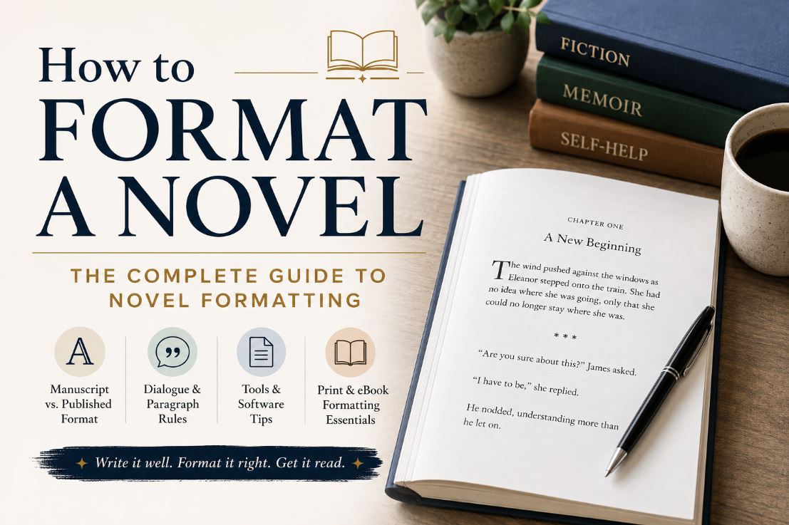
Formatting paragraphs in a novel follows a convention that a surprising number of authors still apply incorrectly. The first paragraph of every new chapter or scene does not get indented. Every paragraph after the first one does. This is standard typographic convention for published fiction. Authors who apply a uniform half-inch indent to every single paragraph, including the opening one, are defaulting to manuscript rules when they should be applying publication rules.
Scene breaks need deliberate handling too. A blank line works in a manuscript. In a formatted print book, a three-asterisk separator or a centered ornamental glyph is cleaner and survives file conversion more reliably than an empty line, which can disappear entirely depending on how the file is processed.
Formatting Dialogue in a Novel, Fiction and Beyond
Formatting dialogue in a novel is where first-time authors make the most consistent mistakes. The rules are not complicated but they require real attention.
Every speaker gets a new paragraph. When dialogue shifts from one character to another, you do not continue on the same line. New speaker, new paragraph, every time. This single rule, when ignored, turns a conversation into a wall of text that readers have to untangle themselves.
Punctuation goes inside the quotation marks in American English. “I told you not to come back,” she said. Not: “I told you not to come back”, she said. The comma belongs inside.
Dialogue tags should be used simply. Said is almost always better than exclaimed or shouted. The dialogue itself carries the emotion. Tags are functional.
When one character speaks across multiple paragraphs, open quotation marks at the beginning of each paragraph but only close them at the very end of the last one. This signals that the same character is still speaking.
Formatting dialogue for a novel also means deciding how to handle internal thought. Spoken dialogue gets quotation marks. Internal thought in modern fiction generally does not. Italics are sometimes used for emphasis but many published novels handle it without any special treatment at all. The key is consistency throughout.
Formatting Speech, Text Messages and Letters in a Novel
Formatting speech in a novel versus written communication inside the story are two different problems. Spoken dialogue follows the rules above. But when a character reads a letter, receives a text message, or encounters any written text within the story world, the formatting needs to visually signal that difference to the reader.
Formatting text messages in a novel has no single agreed standard yet. Common approaches include indented blocks with a slightly different font treatment, or a centered layout that mimics a phone screen. Whatever system you choose, apply it the same way every time it appears. Readers adapt to a formatting convention quickly. They just need it to stay consistent.
Formatting a letter in a novel depends on what role that letter plays. A full formal letter being read by a character works well in a centered block format with slightly different indentation from the surrounding prose. A fragment or a handwritten scrap has more creative latitude. The goal is always the same: the reader should immediately understand what they are looking at without having to stop and figure it out.
Formatting Flashbacks in a Novel and Other Special Elements
Formatting flashbacks in a novel usually relies on a combination of signals rather than one single approach. A scene break before the flashback begins, a shift from past tense to past perfect tense, and occasionally italics if the flashback is very short. Long flashbacks written entirely in italics are genuinely hard to read. A clean tense shift and a deliberate scene break are usually enough to orient the reader.
Correct formatting of a novel title when it appears in the body text: novel titles are italicized. Not in quotation marks, not bolded. Italicized. Short works like short stories, individual poems, and episode titles go in quotation marks. Full-length novels, films, and albums are italicized. This trips up a lot of authors writing fiction where characters reference other books.
Formatting a Novel in Word, Google Docs and Scrivener
Formatting a novel in Word is where most authors start and it is perfectly capable of producing a clean manuscript and a print-ready interior if you know the settings.
The mistakes we see most often: authors using the spacebar or the tab key for paragraph indents instead of setting a proper first-line indent in paragraph settings, page breaks inserted manually instead of using Word’s built-in function, and paragraph styles not applied consistently across the document. That last one causes chaos when the file is converted for eBook distribution.
For formatting a novel manuscript in Word, set your styles at the document level before you write a single word. Normal style for body text, Heading 1 for chapter titles, a separate style for any special elements like letters or flashbacks. Doing this after the manuscript is finished is significantly harder and takes much longer.
Formatting a novel in Google Docs is increasingly common, especially among writers who collaborate or work across devices. Docs is fine for a manuscript going to an agent. For a print-ready interior it has real limitations: page breaks behave differently, the font options are more restricted, and exporting to Word or PDF occasionally introduces artifacts that have to be cleaned up manually.
Formatting a novel with Scrivener is worth the learning curve if you are a serious writer planning multiple books. Scrivener handles the organizational complexity of a long manuscript better than Word or Docs and its compile function, once understood, can output clean manuscript format or a formatted interior depending on what you need. Budget real time for learning it. It is not intuitive on day one.
Formatting a Novel Manuscript for Submission: What Agents Actually Look For
Formatting a novel manuscript for submission is a specific skill and it differs meaningfully from formatting for publication. Agents are not evaluating your published book. They are reading a manuscript, and they want it presented in a format that is easy to read and easy to evaluate.
Standard requirements from most agents: Times New Roman 12pt or Courier 12pt, double-spaced, one-inch margins, page numbers with author name and shortened title in the header, chapter breaks starting on a new page, and a title page with contact information, genre, and word count.
Beyond format, follow the specific submission guidelines each agent publishes on their website. Some want the first ten pages pasted into the query email. Some want a synopsis attached. Some want nothing attached at all. Formatting the manuscript correctly is only half of it.
What We Are Seeing at Writers of the West: A Publishing Perspective
Over the past couple of years our client submissions have shifted noticeably. Fiction is down. Self-help, business books, memoirs, and personal development titles are up, and the gap is widening.
This matters for formatting because these genres do not play by the same visual rules as fiction. The most common mistake we see regardless of genre is authors defaulting to the same safe interior choices across everything they write. Times New Roman, standard chapter headings, no design personality. For a literary novel, that can work. For a self-help book, it reads like a placeholder. Readers of business and self-help titles have been trained by the best books in that space. They expect visual hierarchy, clear chapter architecture, white space that gives the page room to breathe. A self-help manuscript formatted like a fiction novel feels unfinished before the content registers.
Formatting a fiction novel and formatting a business book are not the same job. Treating them the same way is one of the most common and most costly mistakes authors make.
Formatting a Book for Self Publishing, Kindle and Print Publication
Formatting a book for self publishing means making decisions that a traditional publisher would normally make for you. Trim size, interior font, chapter heading design, running headers, page number placement. These are not trivial decisions and they directly affect the reading experience.
Formatting a novel for self publishing in particular requires understanding the difference between what looks good on your screen and what looks good on a printed page. Font sizes that seem reasonable in Word often need adjusting when you see them in a physical trim size. Margins that feel fine digitally can feel cramped in print.
Formatting a novel for Kindle and other eBook readers adds a separate layer of complexity. Kindle uses reflowable text, meaning the reader can change the font size and the text reflows to fit their screen. Fixed layout designs, specific font placements, and decorative elements frequently break in eBook conversion. A print interior and a Kindle interior are not the same file and should not be treated as one.
Formatting a novel for publication across both print and digital means maintaining two separate files or using software that handles both outputs cleanly. Vellum on Mac does this well for fiction. Scrivener can do it with the right compile settings.
For authors who want a professional result without the technical learning curve, our book formatting services handle print and eBook formatting together, making sure the interior reads correctly wherever it ends up.
Formatting Is the Foundation of Book Design
Formatting is not separate from book design. It is the foundation of it. The choice of body font, the design of chapter openers, the spacing decisions that give the page room to breathe, the visual hierarchy that tells the reader where they are at any moment, all of this starts with formatting decisions.
A well-designed book interior and a correctly formatted book are the same thing done properly. Authors who shortchange this part of the process tend to be the ones who come back later wondering why their book is not connecting with readers. Readers cannot always articulate what feels off about a poorly formatted book. They just stop reading it.
Our book design services cover the full interior alongside the cover, because the two need to work as a single visual system rather than two separate decisions made at different times.
Before You Submit or Publish: A Final Formatting Check
Is every paragraph indented consistently using paragraph settings rather than tabs or spaces? Are all chapter breaks starting on a new page? Is your dialogue correctly punctuated with each speaker getting their own paragraph? Are scene breaks marked with a visible separator that survives file conversion? Are all flashbacks, letters, and special elements handled the same way throughout? Is your font correct for what you are submitting or publishing?
If you are submitting to agents: does your title page include your name, contact information, genre, and word count? Are your headers formatted with your name and title on every page?
Once the manuscript is clean and formatted, a final pass from our book proofreading services catches the errors that formatting work tends to surface, inconsistencies that were invisible in the draft but become obvious once the document is laid out properly.
Formatting a novel is not the most exciting part of writing one. It is one of the parts that determines whether what you wrote gets a fair chance to be read.
About the Author
Cell Biologist, Sociologist & Senior Editor, Writers of the West
Robert Whitehead is an American sociologist and cell biologist at the University of Virginia. He has been with Writers of the West for six years, bringing a rare combination of scientific rigor and behavioral insight to biography, fiction, and book design editorial work. His research background strengthens narrative authenticity, analytical precision, and structural coherence across a wide range of manuscript types.
writersofthewest.net · Professional Ghostwriting Services, Book Editing & Publishing Guidance, Book Formatter & Designer