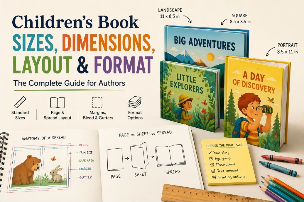
Children’s books don’t come in one size. That trips up more first-time authors than almost anything else in the production process, right up there with picking a font and not knowing what “bleed” means until a printer rejects a file. Square, portrait, landscape, 6×6, 8.5×8.5, 8×10… the options aren’t arbitrary, but they’re not universal either. The right size for your book depends on the reader’s age, how much text you’re carrying, your illustration style, your page count, and, eventually, which printer or platform actually produces the thing.
There isn’t a single “correct” children’s book size. There’s a size that fits your book, and a handful of sizes the industry keeps coming back to because they work.
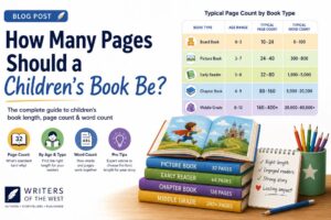
Common Children’s Book Sizes at a Glance
| Children’s Book Type | Common Size(s) | Orientation | Best For | Considerations |
|---|---|---|---|---|
| Board books | 6″ x 6″ (variants: 5″x5″, 7″x7″) | Square | Ages 0-3, thick chunky pages | Small trim, few words per page, durability matters more than size |
| Picture books | 8.5″ x 8.5″, 8″ x 10″, 8.25″ x 8.25″ | Square or portrait | Ages 3-7, illustration-led storytelling | Most commonly recommended self-published trim; full-bleed art works well here |
| Early readers | 6″ x 9″, 5.5″ x 8.5″ | Portrait | Ages 6-8, transitioning to text | More text per page, spot illustrations rather than full spreads |
| Chapter books | 5.25″ x 8″, 5.5″ x 8.5″, 6″ x 9″ | Portrait | Ages 7-10, mostly text | Mirrors adult paperback sizing to keep production costs down |
| Activity/workbooks | 8.5″ x 11″ | Portrait | Coloring, puzzles, worksheets | Needs full-page real estate; costs more per copy at this size |
Take these as starting points, not rules. A picture book about a road trip might genuinely need a landscape shape. A board book with unusually dense illustrations might warrant something bigger than 6×6. The category is a starting assumption, not a ceiling.
What Are the Standard Children’s Book Sizes?
“Standard” here means common, not mandatory. Nobody’s book gets rejected for being 8″ x 10″ instead of 8.5″ x 8.5″. What standard sizes actually give you is predictability: printers know how to handle them, readers recognize the shape, and your book doesn’t look strange sitting next to others in its category on Amazon.
Square Children’s Book Sizes
8.5″ x 8.5″ is widely recommended across self-publishing and print-on-demand guides as the go-to trim size for picture books, largely because it’s available on both major print-on-demand platforms and reads instantly as “children’s book” the second someone sees the thumbnail. The square shape treats every illustration equally. There’s no dominant axis, so a character standing in the center of the page gets roughly the same amount of space above, below, and to each side. That’s useful for books built around a single subject per spread: a character portrait, an object, a simple scene that doesn’t need to sprawl.
The tradeoff is that square formats can feel a little static for anything involving motion or distance. A story about running somewhere, chasing something, or traveling a long way tends to want more width than a square gives it.
Portrait Children’s Book Sizes
Portrait (taller than it is wide) sizes like 8″ x 10″ or 6″ x 9″ give you vertical room. That matters for scenes where height does the storytelling: a beanstalk climbing off the page, a tall building, a character looking up at something enormous. Portrait also tends to be the default choice once a book starts carrying more text than a picture book typically does, since a taller page holds more lines without feeling cramped.
Landscape Children’s Book Sizes
Landscape shapes give illustrators horizontal space, which is exactly what you want for scenes with movement across the page: a parade, a road, a river, a line of animals walking single file. Here’s the part that trips authors up: Amazon KDP’s own paperback lineup barely accommodates landscape at all, one narrow 8.25″ x 6″ option and nothing wider. If your book genuinely needs a big, sweeping landscape shape, KDP isn’t where you’ll find it. IngramSpark is, and that matters more than it sounds like it should, because it means you don’t have to force a landscape story into a squarer, KDP-friendly shape just to get it published. The KDP and IngramSpark sections below cover the specifics.
Children’s Book Dimensions by Book Type
| Type | Typical Dimensions | Typical Reader | Illustration Density | Format Considerations |
|---|---|---|---|---|
| Board book | 6″x6″ | Ages 0-3 | Very high, simple shapes | Thick board pages; not produced as true board stock by KDP or IngramSpark |
| Picture book | 8.5″x8.5″, 8″x10″ | Ages 3-7 | High, often full-bleed | Full color interior needed; drives up per-unit print cost |
| Early reader | 6″x9″, 5.5″x8.5″ | Ages 6-8 | Moderate, spot illustrations | Usually black & white or limited color to control cost |
| Chapter book | 5.25″x8″, 6″x9″ | Ages 7-10 | Low, occasional spot art | Mirrors adult trade paperback sizing |
| Activity book | 8.5″x11″ | Ages 4-10 | Varies | Large trim, higher print cost, but readers expect the room |
Here’s the distinction that matters and gets blurred constantly: some of these numbers are industry convention (what most publishers happen to do), and some are hard technical limits (what a platform will actually let you upload). 8.5×8.5 for picture books is convention. Amazon KDP’s hardcover lineup not including a square option at all is a technical limit. Those are different kinds of facts, and treating them the same way gets authors into trouble late in production.
How We Choose a Children’s Book Size as a Publisher
We don’t start with a trim size and then squeeze the manuscript into it. That’s backwards, and it’s one of the most common mistakes we see coming out of a first draft.
Instead, the questions come first: Who’s actually going to read this, and how old are they? How much text is on a typical page, and does that text need to sit beside the art or underneath it? Is this book led by illustration, or does it lean more toward narrative with occasional images? Do the scenes want width, height, or neither? What happens at the page turn, meaning what’s the reader not supposed to see until they flip the page? And, eventually, where is this actually getting printed, because a size that looks great on your monitor might not exist as an option on the platform you’re using.
Choose the dimensions around how the book needs to work. Don’t pick an attractive trim size first and then force the manuscript and the illustrations to live inside it. Books built the second way tend to have cropped artwork, awkward white space, or text crammed into corners it was never meant to occupy.
The Children’s Book Size & Format Decision Matrix
| If Your Book Is Mainly… | Start By Considering… | Why |
|---|---|---|
| Large illustrated scenes | Landscape | More horizontal room for wide compositions |
| Character-focused, close-up | Portrait | Vertical space suits a single figure or face |
| Illustration-led, no dominant direction | Square | Equal weight on all sides, works for varied scenes |
| Early reader, text-forward | Portrait | Matches expectations for books kids read solo |
| Activity or workbook content | Larger format (8.5×11) | Kids need room to write, color, or solve on the page |
These are starting points. A landscape book about a character’s inner world rather than a journey might do better in portrait despite being “illustration-led.” Use judgment, and test it, which is exactly what the next section is for.
How Does Children’s Book Layout Work?
Children’s book layout is the arrangement of text, illustrations, pages, spreads, margins, and other visual elements within the book’s final dimensions. It’s not graphic design theory. It’s the practical decisions that determine whether a spread reads clearly or fights itself.
Page vs. Sheet vs. Spread
These three terms often get mixed up, and the mix-up causes real confusion during production.
A page is one numbered side, one face of the book. A sheet (sometimes called a leaf) is the physical piece of paper, which has two sides and therefore contains two pages. A spread is the two facing pages a reader sees when the book is open flat.
Here’s why this matters in practice: a beginner hears “32-page picture book” and assumes that’s 32 individual illustrations or 32 full spreads. It’s neither. A 32-page book is roughly 16 spreads once you account for front matter (title page, copyright page) eating into that count. Plan your story beats against spreads, not against a raw page number, or you’ll end up with fewer usable illustration opportunities than you budgeted for.
Designing the Spread, Not Just the Page
Most picture books are experienced two pages at a time, not one page at a time. That changes how you compose everything. A closed trim size of 8″ x 10″ becomes roughly 16″ x 10″ once the book is open (before accounting for the binding itself, which eats a small amount of space in the middle).
That middle space, the gutter, is where a lot of first attempts go wrong. A character’s face split right down the center by the binding looks bad in a way that’s hard to fix after illustrations are finished. Important faces, text, and focal points need to sit clear of that seam, and reveals that depend on a page turn need to land on the correct side of it.
Text and Illustration Placement, Page Turns
Page turns are a storytelling tool, not just a mechanical necessity. A reveal loses most of its impact if it’s visible on the same spread as its setup. Put the setup on one spread, force a page turn, then deliver the reveal on the next one. Text density and illustration opportunities need to breathe together across the whole book, not just within individual pages, which is easier to manage if it’s planned before the art is finished rather than fixed afterward.
The 3-Spread Test
Before committing to a trim size and orientation, run this:
- Pick three of your most important scenes.
- Rough out each one as a two-page spread, even just as a thumbnail sketch.
- Add approximate text placement to each.
- Try the same three scenes in square, portrait, and landscape.
- Look at where characters and focal objects land in each version.
- Check the gutter. Does anything important get lost in the binding?
- See whether the text and the illustration are competing for the same space.
- Pick whichever format holds up consistently across all three scenes.
The point isn’t finding the format where one scene looks best. It’s finding the format that doesn’t break down anywhere. A landscape shape might make your big chase scene look incredible and then leave your quiet closing scene feeling stretched and empty. That’s a sign the book needs a different shape, even if it costs you your favorite spread.
What Is the Best Children’s Book Format?
There isn’t one best children’s book format. The right choice depends on the book, and “format” itself is doing double duty here: it can mean orientation (square, portrait, landscape), physical edition (paperback, hardcover), or presentation (print, ebook), depending entirely on which question someone’s actually asking.
Square vs. Portrait vs. Landscape
Covered above, but the short version: square is a safe default for illustration-led picture books, portrait suits vertical scenes and higher text density, landscape suits horizontal motion but comes with real platform limitations (see below).
Paperback vs. Hardcover
Paperback is cheaper to produce and more forgiving for a first print run. Hardcover often reads as more gift-appropriate, which is worth weighing given how much of children’s book buying happens as gifts, but it comes with a narrower set of available trim sizes. Amazon KDP’s five hardcover trim sizes don’t include a square option. IngramSpark’s hardcover range technically allows something close to square within its size bounds, but availability and pricing for non-standard combinations should be confirmed directly with IngramSpark before committing artwork to that shape.
Print vs. Ebook
Ebooks sidestep trim size and bleed entirely but introduce their own headache: fixed-layout formatting, since a reflowable ebook destroys the careful spread composition a picture book depends on. If print and ebook are both planned, budget for two separate formatting passes, not one file exported two ways.
Children’s Book Trim Size Explained
Trim size is the finished, physical width and height of the book after the printer cuts the pages down to their final dimensions. It’s called “trim” because that’s literally what happens: pages print slightly oversized, then get trimmed to the exact size you specified.
This matters for artwork because anything meant to reach the edge of the page has to extend past the trim line before the cut happens, or you’ll get a thin white line where the printer’s blade wasn’t perfectly aligned with your art. Settle the trim size before final illustration work begins. Changing it afterward usually means cropping, recomposing, or in the worst cases fully redrawing spreads that were built for a different shape.
Bleed, Margins, Safe Area and Gutter
| Term | Meaning | Why It Matters |
|---|---|---|
| Trim | The finished size of the book after cutting | Everything else is measured relative to this |
| Bleed | Extra artwork extending past the trim line | Prevents white edges after the page is cut |
| Margin | Space between content and the trim edge | Keeps text and important art from getting clipped |
| Safe area | The zone inside the margins where nothing critical should be missed | Protects against minor trimming variance during production |
| Gutter | The inside margin, closest to the spine/binding | Prevents content from disappearing into the binding |
To put real numbers on this, per Amazon’s current specifications (KDP: Set Trim Size, Bleed, and Margins): KDP requires 0.125″ of bleed on all sides for anything meant to reach the page edge, and if even one page in your interior needs bleed, the entire file has to be set up with it. Outside margins need to be at least 0.25″ without bleed, or at least 0.375″ if the file has bleed. The inside margin (gutter) scales with page count: 0.375″ for books under 150 pages, climbing to 0.875″ for books approaching 800 pages, since thicker books need more room near the spine to keep text from vanishing into the binding.
A practical scenario: if an illustration runs edge-to-edge on the page, it needs bleed. If a character’s face sits close to the center of a spread, the gutter becomes the thing to watch. If text sits too close to the trim line without enough margin, it risks getting cut during manufacturing. These aren’t hypothetical; they’re three of the most common reasons a proof copy comes back looking wrong.
If You Change One Thing, What Else Changes?
| If You Change… | You May Also Need to Change… |
|---|---|
| Trim size | Illustration dimensions and composition |
| Aspect ratio | Cropping and scene composition |
| Page count | Story pacing and number of spreads |
| Font size | How much text comfortably fits per page |
| Margins | Text and illustration placement |
| Bleed | Artwork dimensions |
| Binding | Gutter width |
| Print platform | Which sizes are even available to you |
None of these decisions live in isolation. Size, layout, illustrations, page count, and production method are one interconnected system, not eight separate checkboxes you tick off in order.
How Children’s Book Layout Affects the Writing
Layout isn’t something that gets bolted onto a manuscript after the words are finished. For an illustrated children’s book, it shapes the writing itself, and this is where the line between writing and design mostly disappears.
A story beat has to land somewhere specific: on a spread, at a page turn, or held back for a reveal. When our children’s book ghostwriters are drafting a manuscript, they’re already thinking in spreads rather than paragraphs, because a beat that reads fine on a page can fall flat once it’s mapped onto the actual physical structure of the book. A joke or a reveal placed one spread too early loses its page-turn payoff. A quiet emotional moment crammed onto a spread that’s already carrying a busy illustration gets buried instead of felt.
Text density follows the same logic. A spread built around a single, striking illustration usually wants a sentence or two, not a paragraph competing for the reader’s attention. A spread built for a transitional beat, moving the story from one scene to the next, can usually carry a little more text since there’s less illustration doing the emotional work. None of this is decided by word count targets. It’s decided by what each spread needs to accomplish in the story, which is exactly why trim size, page count, and manuscript pacing get worked out together rather than in sequence.
When Should You Choose Your Book’s Size?
Before the illustrator starts final artwork. Ideally before they start any artwork at all.
If illustrations get commissioned for one aspect ratio and the trim size changes significantly later, you’re looking at cropping, extending backgrounds, repositioning characters, or in bad cases starting over. That’s lost money and lost time that a five-minute conversation about trim size at the very start would have avoided.
This is also, not coincidentally, the point where a structural edit pays for itself. A children’s book editor reading the manuscript before illustration begins can flag pacing problems, spreads that are carrying too much text, or reveals sitting on the wrong side of a page turn, all of which are far cheaper to fix on the page than after an illustrator has already built art around them.
Children’s Book Sizes for Amazon KDP
Per Amazon’s own current specifications (KDP: Set Trim Size, Bleed, and Margins), KDP paperback offers 16 trim sizes total, and only two of them are square: 8.25″ x 8.25″ and 8.5″ x 8.5″. Only one is genuinely landscape (wider than it is tall): 8.25″ x 6″. Everything else on the list is portrait.
That last point is worth flagging because it runs against a claim repeated across a number of self-publishing blogs: that KDP itself supports wide landscape picture book formats like 10″ x 8″ or 11″ x 8.5″. Based on the specifications Amazon currently publishes (linked above), those aren’t listed as options for KDP paperback. If a book genuinely needs a big, sweeping landscape shape, KDP’s own paperback list simply won’t get you there. That doesn’t mean the book can’t happen, it means the wrong platform got asked to do it. See the IngramSpark section below for where that landscape option actually lives, and don’t spend time trying to shoehorn a wide scene-driven story into KDP’s narrow 8.25″ x 6″ landscape option just because KDP is the more familiar name.
Hardcover is more restrictive again. KDP currently supports five hardcover trim sizes: 5.5″x8.5″, 6″x9″, 6.14″x9.21″, 7″x10″, and 8.25″x11″. None of them are square, and none are landscape. If a square hardcover picture book is the goal, standard KDP print-on-demand isn’t going to get you there.
Bleed on KDP is 0.125″ on all sides, and once a paperback is published, the trim size can’t be changed. A different size means publishing a new title from scratch, not editing the existing one, so this is worth getting right before the first upload rather than after.
Children’s Book Sizes for IngramSpark and Wider Distribution
IngramSpark works a little differently than KDP, and this is where the landscape problem actually gets solved. IngramSpark supports a genuine 11″ x 8.5″ landscape trim for children’s picture books, in both paperback and case hardback, confirmed directly through IngramSpark’s own guidance to book designers working in this size. The tradeoff is that it requires premium color printing, which narrows profit margins on a per-copy basis, but it’s a real, available option, not a workaround. That’s a meaningfully wider canvas than KDP’s own 8.25″ x 6″ landscape ceiling, and it’s the reason a big scene-driven story doesn’t have to be redesigned around KDP’s narrower shape.
IngramSpark’s broader specifications (IngramSpark: Print Book Options, Trim Sizes) describe custom sizing ranging up to 8.5″ x 11″ on white paper for paperback, and a similar ceiling for hardcover, with crème and groundwood paper options topping out smaller. Named trims like the 11″ x 8.5″ landscape sit within that broader system. Specs on print-on-demand platforms shift over time, so before locking in a size, especially anything unusual, it’s worth confirming current availability directly with IngramSpark rather than relying on any single guide, including this one, a year from now.
Here’s the part that matters most for distribution: a book printed through IngramSpark isn’t limited to niche or specialty retailers. IngramSpark’s distribution network includes Amazon and most major retailers and libraries, so a landscape picture book that KDP’s own paperback list can’t accommodate still ends up for sale in the same places a native KDP listing would reach. There’s no need to compromise the book’s shape just because Amazon happens to be the platform most authors think of first.
If a book is going out through both KDP and IngramSpark for a size both platforms support natively, picking a size available on both means one interior file works everywhere instead of two separate formatting passes. That’s worth doing when it’s an option. It’s just not the right fix for a book that genuinely needs the wider canvas.
Common Children’s Book Formatting Mistakes We See
- Choosing trim size after the illustrations are already finished
- Letting important artwork sit too close to the gutter
- Insufficient bleed, leaving thin white lines after trimming
- Text set too close to the trim edge
- Picking a format because a bestseller in the genre uses it, without checking whether the story actually suits that shape
- Cramming too much text onto an illustrated spread instead of letting art and text share the space
- Designing every page independently instead of thinking in spreads
- Ignoring how page turns affect pacing and reveals
- Inconsistent margins from spread to spread
- Starting design before checking the actual specs of the printing platform
- Resizing existing illustrations without considering how that changes the aspect ratio
- Assuming an ebook will simply inherit the print layout without any rework
What Size Should MY Children’s Book Be?
Work through this in order:
- Who’s reading it? Age range changes almost everything downstream.
- How much text is there? More text generally pushes toward portrait.
- How important are the illustrations? Illustration-led books lean square or landscape; text-led books lean portrait.
- What orientation do your actual scenes need? Not what looks nice in the abstract, what your specific spreads require.
- Run the 3-Spread Test. Pick your three toughest scenes and see what holds up.
- Where will this be printed? KDP and IngramSpark support different trim sizes, especially for landscape, so this isn’t a detail to sort out last.
- Does your preferred format actually exist within those constraints? If not, adjust before locking anything in.
Once those seven answers are in front of you, the dimensions tend to pick themselves.
Children’s Book Size, Layout & Format FAQs
What is the standard size of a children’s book? There isn’t a single standard, but 8.5″ x 8.5″ is widely recommended as the most common trim size for self-published picture books, largely because it’s available on both major print-on-demand platforms.
What size should a children’s picture book be? It depends on the story, but 8.5″x8.5″ (square), 8″x10″ (portrait), or 8.25″x8.25″ are the most common starting points for illustration-led picture books.
Is 8.5 x 8.5 a good size for a children’s book? For most picture books, yes. It’s widely supported, reads as instantly recognizable to buyers, and works well for illustrations without a strong horizontal or vertical pull. It’s not available as a hardcover option through Amazon KDP.
Should a children’s book be square or portrait? Square suits illustration-led books without a dominant direction. Portrait suits books with more text, or scenes that need vertical space.
What is children’s book trim size? The finished physical dimensions of the book after the printer cuts the pages to size.
What is a spread in a children’s book? The two facing pages a reader sees when the book is open, as opposed to a single page or a single sheet of paper (which has two pages, one on each side).
What is bleed in children’s book formatting? Extra artwork extending past where the page will be trimmed, 0.125″ on Amazon KDP, so no white edge appears after the cut (source).
How do you layout a children’s book? By designing across two-page spreads rather than single pages, keeping important content clear of the gutter, planning page turns around reveals, and settling the trim size before final illustrations are produced.
Should I choose my book size before hiring an illustrator? Yes. Changing trim size after illustrations are finished usually means cropping, recomposing, or redrawing artwork that was built for a different shape.
What children’s book sizes does Amazon KDP allow? 16 paperback trim sizes, only two of them square (8.25″x8.25″ and 8.5″x8.5″) and one landscape (8.25″x6″), plus 5 hardcover sizes, none square or landscape (source). Always verify current KDP documentation before finalizing, since specifications can change.
About the Author
Fiction & Speculative Narrative Editor, Writers of the West
Natalia Coldwater holds a B.A. in Creative Writing from Brooklyn College and specializes in speculative fiction, psychological storytelling, and personal development editing. Based in Brooklyn, NY, she has been with Writers of the West for over two years, working across memoir, self-help, and fiction manuscripts. Her editorial focus centers on emotional clarity, character voice, and transforming complex experiences into structured, reader-ready narratives.
writersofthewest.net · Professional Ghostwriting Services, Book Editing & Publishing Guidance