Discover the must-have elements for an eye-catching eBook cover and interior title page. Learn how to design a professional, sales-boosting front page that captures readers from the first glance.
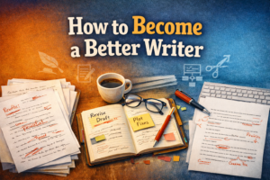
Introduction: The “Front Page” = Your 3-Second Pitch
Here’s the brutal truth: readers don’t give you ten minutes to prove your book is worth their time. They give you three seconds. Maybe less. That’s it. Click or scroll away.
And that’s why the front page of an eBook is not decoration. It’s not fluff. It’s your pitch, your handshake, your “yes, I belong on your screen” moment.
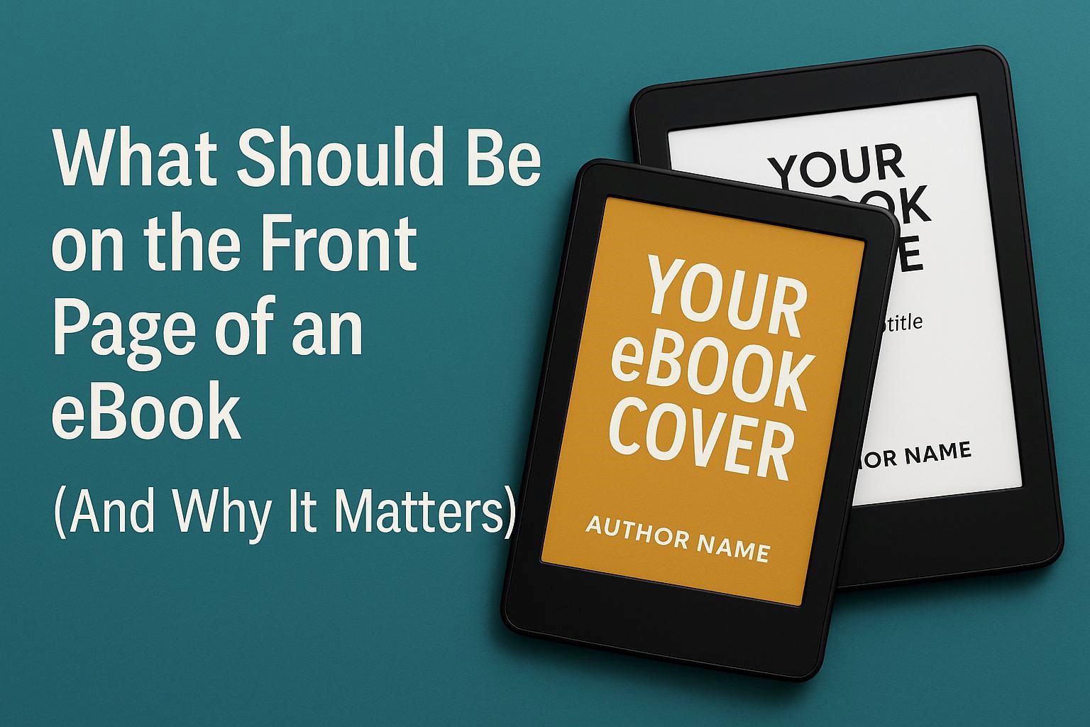
But here’s where authors get tangled. What even is the front page? In publishing lingo, it’s actually two things. First, the cover, the image that shows up in online stores, libraries, and those tiny thumbnails where attention goes to die. Second, the title page, the first interior page your reader sees when they open the book. Two different beasts. Both powerful. Both capable of making you look like a pro or like an amateur fumbling with Microsoft Word.
And that’s what we are tackling here. You will learn what absolutely belongs on your cover, what goes on your interior title page, and how to avoid the rookie mistakes that scream “self-published with no clue.” By the end, you will have a simple system to make sure your eBook not only survives that three-second test, but wins it.
Part 1: The eBook Cover (Storefront Essentials)
Why the Cover Matters
Your cover is your shop window. It is the sign outside the restaurant, the smell that drifts from the bakery, the single frame that decides if someone leans in or walks past. Online, your book does not sit face out on a shelf. It sits in a flood of thumbnails, each screaming for attention.
So if your cover fails, your book fails. Period.
Readers don’t analyse covers with patience. They glance. They register colour, shape, and whether the text is readable. They subconsciously judge genre. Then they decide. That’s it. Which means your cover has one job. Stop the scroll.
And here’s the thing. If your title is unreadable at thumbnail size, you are done. If your design looks like a school project, you are done. If your genre cues are confusing, you are done. Harsh? Yes. True? Absolutely.
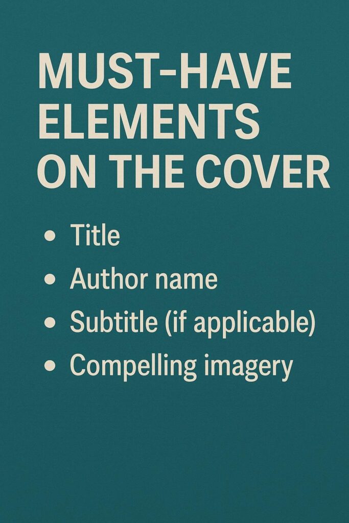
Must-Have Elements on the Cover
So what goes on this all-important rectangle? Let’s strip it down.
- Title: Big. Clear. Dominant. Your title carries the weight. If readers cannot read it at 100 pixels wide, it fails.
- Subtitle (if you have one): This is your promise. Your positioning. Nonfiction lives or dies here. Fiction often skips it, but when used well it adds power.
- Author Name: Always present. Always consistent. This is how readers remember you, search you, and trust you. If you plan to build a brand, protect your name.
- Typography and Layout: Not decoration. Typography is the silent salesperson. It signals genre and tone. A thriller cover does not use curly script fonts. A romance cover does not use military stencil type.
- Optional Extras: Endorsement blurbs, series badges, award seals. But here’s the warning. Use sparingly. A tiny badge can validate. A cluttered mess can destroy.
The rule: clarity beats cleverness.
Design Best Practices That Work at Thumbnail Size
This is where most authors trip. They design on a full screen, fall in love with details, and forget that readers will first see their cover at the size of a postage stamp.
Here’s what works:
- Strong contrast: Dark against light. Bold against soft. The human eye loves contrast.
- Limited palette: Too many colours? Cheap. One or two strong tones? Professional.
- Genre cues: Romance? Think soft tones, elegant fonts, emotional imagery. Sci fi? Think sharp edges, cosmic palettes, futuristic type. Crime? Stark contrasts, gritty textures. Readers look for signals. Give them what they expect.
- No clutter: Every extra swirl, shadow, or busy background makes your title less readable.
The test is simple. Shrink your cover to 100 pixels wide. Can you read the title? Can you feel the mood? If not, fix it.
Platform Specifications to Get Right
Each store has its own technical rules, but let’s keep it simple. For Kindle Direct Publishing (KDP), Amazon recommends a minimum of 2560 x 1600 pixels with a 1.6:1 aspect ratio. File size under 50MB. JPG or TIFF format. That is the baseline. Every reputable firm that provides Amazon publishing services follow these guidelines.
But specifications change. Always double check the platform’s official guidelines before upload. Skipping this step can mean rejection or ugly stretching. Not worth the risk.
And here is a bonus: treat your cover file as part of your ebook formatting tips toolkit. A great manuscript with a weak or incorrectly sized cover is like dressing for a wedding in stained sweatpants. Readers will never even open the door.
Part 2: The Interior Title Page (First Page Inside)
What the Title Page Should Include
Once someone clicks your book and opens it, your cover has done its job. Now the baton passes to the title page. This is the quiet confirmation that tells the reader, “Relax. You are in good hands. This book is the real deal.”
So what belongs here? Strip it to the essentials.
- Main Title: Exactly as it appears on your cover. No tweaks. No variations. Consistency is trust.
- Subtitle: If you use one, bring it here. It reinforces the promise your book makes.
- Author Name: Formal. Clean. And without the little word “by.” Industry convention leaves it out. It looks sharper and more professional.
- Publisher or Imprint: If you have one, include it. Even if it is your own imprint. A single word and a simple logo can add authority.
Optional Details: Edition, series information, or year of publication. These are nice to have but not critical.
Keep it centred. Keep it clean. Think of it like a stage spotlight. No clutter, no distractions, just the essentials presented with clarity.
Where It Sits and How It Displays
The title page usually comes right after the cover image, either as the first or second interior page. But here’s where it gets tricky. Many eBook platforms are set up to drop readers straight into the first chapter. Which means they might skip your title page completely unless you get the navigation right.
Your job is to make sure the flow is logical. Cover image. Title page. Copyright page. Then into the story. That order feels natural. It feels polished. Anything else feels sloppy.
And here is something most authors don’t realise. A messy front section can hurt your credibility before a single word of your story is even read.
Front Matter Adjacents You May Add
Some authors like to add extras around the title page. A half title page, for example, with just the title printed alone. A dedication page. A table of contents. Maybe even a preface or foreword.
These are all valid, but you need to remember one rule. In eBooks, less is more. Readers bought your book because they want the story or the knowledge. Do not bury them under seven pages of filler before you deliver.
Here is a good balance.
- Title page
- Copyright page right after it
- Dedication page if you really want one
- Table of contents for nonfiction or longer works
Everything else can live in the back. Put your acknowledgments, notes, and long author bios after the main content, not before it.
Why This Matters
Your interior title page is not just a formality. It is branding. It is professionalism. It shows you respect the conventions of publishing while giving your reader a smooth start. Ignore it and your book feels amateur. Nail it and your book feels credible from page one.
Think of it this way. The cover wins the click. The title page sets the tone. Together they make sure your book feels like it belongs next to the bestsellers.
And if you are following ebook writing guidelines, this is one of the non negotiables. A clean title page is part of the unspoken checklist that separates hobby projects from books readers actually take seriously.
Part 3: Crafting for Readability, Metadata, and Accessibility
Readability and Typography
Think of your title page as the quiet drumbeat before the music kicks in. The typography here should echo your cover. If your cover screams “romantic fantasy” in flowing script, don’t suddenly throw a blocky sans serif font on the inside. If your cover is sharp, modern, and clean, keep the inside sharp, modern, and clean.
Consistency is the trick. It builds trust. Readers do not notice when things match. They only notice when they clash.
Keep the layout centred. Keep the lines spaced so the text breathes. Small screens magnify mistakes. What looks neat on your laptop can look cramped on a phone. Remember, most people will read your book on a six inch screen, not a twenty seven inch monitor.
Test it. Load your draft onto an actual device and see what it feels like. Not just once. On multiple screens. Because if your title page looks off, your reader feels it before they even begin chapter one.
Accessibility and Device Behaviour
EBooks are not print books. They live inside devices, which means they behave differently. Some readers open straight to the text. Others start at the cover or title page. You cannot control that. But you can control the order of your file.
The proper sequence should be cover, then title page, then copyright page. Skipping or scrambling these makes your book harder to navigate. Worse, it signals you don’t know what you are doing.
Accessibility is just as critical. Do not make your title page a single image. It might look pretty, but screen readers cannot interpret it. That means blind or visually impaired readers are left out. Use live text for titles and names. Decorative fonts are fine as long as they are still legible. If you insist on a graphic title page, include a text-based version as well.
Good formatting is not just about looking professional. It is about making sure everyone can actually read your work.
Store and File Prep Checklist
This is where the invisible work pays off. Before you hit publish, walk through this checklist.
- Fonts: Embed them properly and make sure you have the licences. No pirated fonts. No “it looked fine on my computer” excuses.
- Navigation: Confirm the table of contents works. Click the links. Make sure the title page, copyright, and chapters are all accessible.
- Previewing: Test your file in Kindle Previewer, Apple Books, and whatever device you can get your hands on. What works in one can break in another.
- Validation: Run your EPUB through an online validator. Errors here can stop your book from being published at all.
It sounds tedious, but it is the difference between being taken seriously and being ignored.
Why This Layer Matters
Readers don’t thank you for clean formatting. They don’t praise you for getting the order right. They only notice when it is wrong. That is why professionals obsess over details like metadata, navigation, and readability.
Remember this. The first page of an eBook is not just the start of a story. It is the start of a reader’s trust in you. From typography to accessibility, every small choice either builds that trust or chips away at it.
Part 4: Common Mistakes to Avoid
Mistakes on your front page are like typos in your opening sentence. They scream louder than anything else. They break trust before you even get started. And the sad truth is, most of these mistakes are avoidable. Let’s walk through the traps that catch authors again and again.
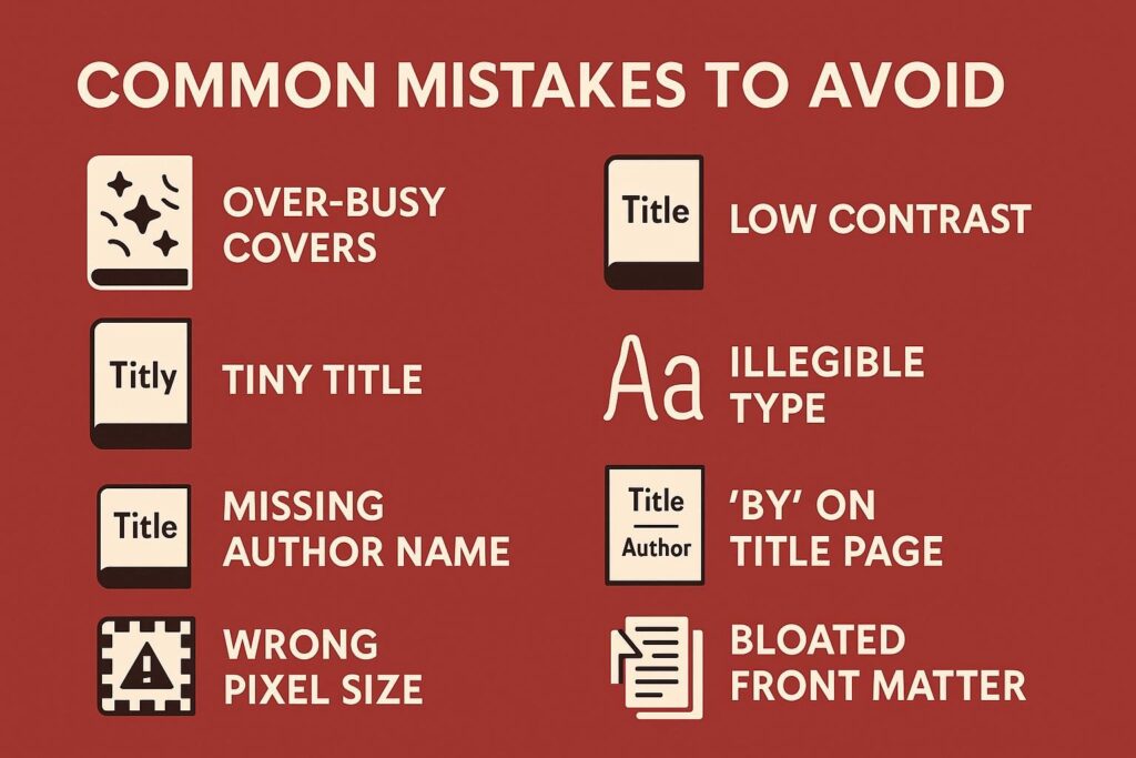
Over-Busy Covers
Too much going on is the fastest way to kill a cover. Authors think more equals better, so they stuff in graphics, swirls, gradients, and stamps. The result? A chaotic mess. Remember, clarity wins. A single strong image beats ten random ones every time.
Low Contrast
Light text on a light background. Dark text on a dark background. It might look “artistic” in full size, but shrink it to thumbnail and it vanishes. Readers cannot click what they cannot see. High contrast is not optional. It is survival.
Tiny Title
This one hurts to even write. Your title is your crown. Yet authors shrink it to make room for busy illustrations or giant author names. Bad move. If readers cannot read the title, the book is invisible. Put the title front and centre.
Missing Author Name
It sounds obvious, but you would be shocked how often it happens. An author uploads a book with a stunning title design and then forgets to include their own name on the cover. Do not disappear yourself from your own book. Your name is part of your brand. Treat it with respect.
Illegible Fonts
Yes, that calligraphy font looks beautiful on your design program. No, it will not work at thumbnail size. No one should have to squint to read your book title. If you are in doubt, default to something bold, clean, and readable.
Wrong Pixel Size
This is the technical killer. Uploading a cover at the wrong dimensions leads to stretched images, blurry edges, or outright rejection from the platform. Kindle, for example, has very clear specs. Ignore them and your book will look amateur or worse, not publish at all.
“By” on the Title Page
This one is sneaky. You think you are being formal when you write “By John Smith” on your title page. But industry convention says no. Just your name. No extras. “By” makes your book look like a school essay, not a professional publication.
Copyright Page Buried Too Deep
Your copyright page should live right after the title page. Authors often bury it behind dedications, contents, or forewords. That is not just sloppy, it can cause legal headaches. Keep it upfront where it belongs.
Bloated Front Matter
This is one of the most common sins. Authors load their eBook with pages of acknowledgments, quotes, and rambling notes before the actual story starts. Online readers have no patience for that. Keep it lean. Keep it moving.
The Fix
The good news is that every mistake on this list has a simple fix. Test your cover at thumbnail size. Double check your dimensions. Use clean fonts. Put your copyright page where it belongs. Cut the fat from your front matter. And if you are stuck, lean on proven ebook formatting tips instead of winging it.
The mistakes are loud, but the solutions are simple. Choose clarity. Choose professionalism. That is how you earn trust and clicks.
Part 5: Quick Templates
By now you know the theory. Covers matter. Title pages matter. But sometimes theory still feels abstract. You need something you can grab, copy, and use. That is where templates come in. Simple frameworks that strip away the guesswork and give you confidence that your book will look like it belongs in the marketplace.
Let’s start with the cover.
Cover Content Template
Think of your cover as your billboard. Every element needs to earn its place. Here is the lean version:
- Line 1: Title. Make it dominant. Big. Clear. The star of the show.
- Line 2: Subtitle. Only if you have one. Think promise, positioning, or benefit. This line tells the reader why the book matters to them.
- Line 3: Author Name. Always included. Always consistent with the name you plan to use across all your books.
Optional extras: a small series badge, an award seal, or a one line blurb. The key is minimal. A sprinkle of seasoning, not the entire dish.
This formula works across genres. Romance, thriller, business, self help. What changes is the typography, colour, and imagery, but the content order is always the same.
Title Page Template
Once inside, the title page acts as confirmation that the cover did not lie. Here is the clean, professional format:
[All text centred on the page]
- Title
- Subtitle
- Author Name
- Imprint or Publisher (with logo if you have one)
- Edition (optional)
- Year (optional)
Notice what is missing. The word “by.” It does not belong here. Keep it sharp. Keep it formal.
This minimal structure is standard for a reason. Readers trust what looks familiar. If you try to reinvent the wheel here, it will only distract from your story.
Why Templates Work
Templates free you from indecision. They give you a tested, reliable structure that prevents rookie mistakes. You no longer waste time wondering if the imprint should go above or below the author name. You no longer debate whether to put the copyright page before or after. You simply follow the order and move forward.
And that is exactly what you want at this stage. Momentum. Momentum beats perfection.
When to Get Help
Of course, not everyone feels confident designing their own cover. And that is fine. A sloppy design can sabotage a great manuscript, so sometimes investing in professional book design services is the smartest move you can make. Even if you use a template, a pro can elevate the look, fix the typography, and ensure your cover nails the tiny thumbnail test.
The templates here will give you a safe baseline. If you want polish beyond that, hand it to a designer. Either way, you win.
Why This Matters
Think of it this way; the front page of an eBook is not a mystery. It is a system. A cover that attracts. A title page that confirms. Templates make that system easy to repeat every time you publish. No guesswork. No panic. Just a book that looks the part from the very first page.
Part 6: Workflow From Concept to Store
Publishing an eBook is not just about finishing the manuscript. That is only half the game. The other half is making sure your book looks and feels professional from the moment someone sees it in a store to the second they start reading. Without a clear workflow, things slip. Covers get rushed. Title pages look sloppy. Files break on devices. Readers click away.
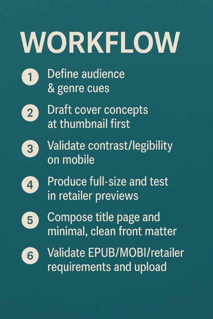
Here is a step by step system to keep you on track.
Step 1: Define Audience and Genre Cues
Before you even touch design, know who you are talking to. A thriller audience expects grit and shadows. Romance expects softness and warmth. Business nonfiction expects bold clarity. These cues are not decoration. They are signals. Miss them and readers feel the disconnect instantly.
Step 2: Draft Cover Concepts at Thumbnail First
Do not start with the full size version. Shrink it. Test it small. Because that is how readers will first see it. At thumbnail size your clever details vanish. Your layout either survives or collapses. Build for that moment. If your title is readable and your genre is clear at tiny size, you are on the right track.
Step 3: Validate Contrast and Legibility on Mobile
Load your draft cover on a phone. Scroll through it next to other covers in your genre. Does it pop? Does it stand out? Or does it fade into the crowd? Contrast is everything. A weak title colour or muddy background will bury your book before it even gets a chance.
Step 4: Produce Full Size and Test in Retailer Previews
Once your thumbnail passes the test, expand it to full size. Then upload it to Kindle Previewer, Apple Books, or Kobo tools. Look at it as a buyer would. Does it still feel professional? Do the proportions hold up? Previews expose flaws that your design program hides.
Step 5: Compose Title Page and Minimal Front Matter
Next comes the interior. Build your title page clean and centred. Follow the conventions you already learned. Then add only what is necessary: copyright page, dedication if you want one, table of contents if the book needs it. Resist the urge to overload. Less keeps readers moving.
Step 6: Validate File Requirements and Upload
Finally, check your technicals. Fonts embedded. Navigation working. EPUB validated. Cover dimensions within platform rules. Then upload. This step is tedious but critical. A single error here can delay your launch or wreck your reader’s experience.
Why Workflow Matters
A strong workflow turns chaos into clarity. It keeps you from second guessing at every turn. Instead of wondering what comes next, you just follow the steps. That is the hidden power behind every polished eBook you see on the market.
And here is the bigger truth. Following a system is part of following ebook writing guidelines. Professionals do not wing it. They follow proven processes. They respect the details. And that is why their books stand tall in crowded marketplaces while others vanish without a ripple.
Frequently Asked Questions
Q1. Should the cover image also appear as the first page inside the eBook?
Yes, but do not rely on it alone. Every retailer handles opening pages differently. Some drop readers on the cover, others jump straight to the text. Always include both a cover image asset and a proper title page. That way, no matter where the reader lands, your book looks professional.
Q2. What absolutely must be on the interior title page of an ebook?
Your title, any subtitle, and your author name. If you have a publisher or imprint, add it. Keep “by” off the author line. Clean and formal is the standard.
Q3. Do I need a copyright page at the very front of an ebook?
Yes. Place it immediately after the title page. This page protects your work legally and signals professionalism. Do not bury it deep in the book.
Q4. What cover specs should I follow for Kindle?
Amazon KDP recommends 2560 x 1600 pixels with a 1.6:1 ratio. File size under 50MB. JPG or TIFF format. Always double check the latest KDP specs before uploading because rules can change.
Q5. How do I make the cover of an ebook work at thumbnail size?
Use bold contrast. Limit your colour palette. Keep fonts big and clear. Shrink your design down to 100 pixels wide and test if the title is still readable. If it fails there, it fails everywhere.
Q6. Can I use a decorative, image-only title page for the front page of an ebook?
You can, but it is risky. Image-only pages break accessibility because screen readers cannot read them. The safer approach is to use text-based pages that keep type crisp across all devices.
Q7. What optional front matter is okay in an eBook?
A short dedication, a table of contents, maybe acknowledgments. Keep it brief. Long notes, extended bios, and lengthy thank-yous belong at the back.
Conclusion
Your eBook rises or falls in its opening seconds. The cover grabs attention in the store. The title page reassures the reader once they open it. Together they are your silent sales team, working before a single word of your story is even read.
The formula is simple but powerful. A cover that passes the thumbnail test. A title page that looks clean and professional. Minimal front matter that does not block the story. A workflow that keeps everything consistent, accessible, and aligned with platform rules.
Do these things and readers never stop to question whether your book belongs. They just dive in. Ignore them and your book risks looking like an amateur project, no matter how good the writing is. Your job is not to overcomplicate. It is to respect the details. And it all starts with the front page of an ebook.